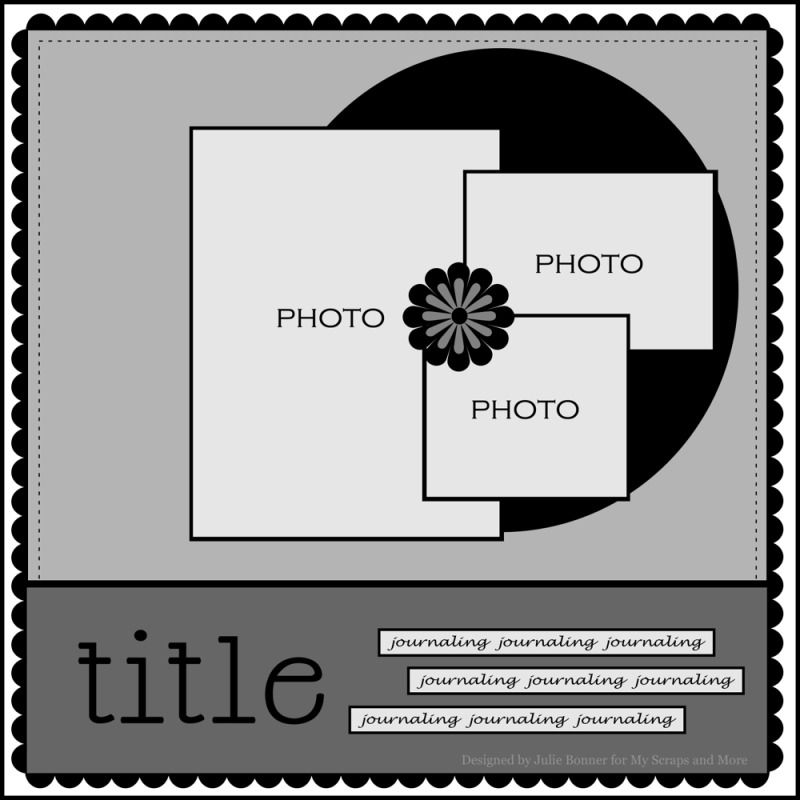
My Scraps and More currently has a contest running this summer called My Scraps Got Talent II. There are layout challenges posted each week as well as mini challenges. I had done a couple of the mini challenges a in the last couple of weeks for some cards, but I finally got around to doing one of the layout challenges. Challenge #5 was to use the sketch below along with 3 different punches for a layout.
As you can see, I added a couple of photos instead of having a large photo on the left side. I also played around with the embellishment placement. For the background, I wanted something subtle, so I used a Crafter's Workshop mask and three colors of Glimmer Mist: Blue Skies, Slate, and Golden Terra Cotta. To balance the extra photos, I felt the title and journaling should both be moved to the right side of the layout. As for the three punches, I used a scalloped circle punch, a border punch and a flower punch. These are the photos I entered in the county fair competition in 2010. I didn't win any ribbons, but they do look nice together on a scrapbook page! :)
Materials
Cardstock- Bazzill, American Crafts
Patterned Paper- My Mind's Eye
Mask- The Crafter's Workshop
Spray Ink- Tattered Angels
Ink- Tsukeniko
Pen- marvy
Punches- EK Success, Marvy, Tonic
Gems- Prima, Hero Arts, Target
Die Cuts- K and Company, My Mind's Eye
Canvas- Prima
Rub ons- Making Memories, We R Memory Keepers, American Crafts
Sticker- Fiskars
Die Cutter- Provo Craft
Cartridge- Cricut Classic Font
Sketch by Julie Bonner


very beautiful
ReplyDeletescrapbises
pretty