Sunday, February 28, 2016

Scavenger Hunt Sunday 2-28-16

Hello! I almost didn't get this posted, but decided to put together a post quick with my photos for the Scavenger Hunt this week!

Waiting
My youngest, waiting for someone to push him on his tricycle. It was nearly 60 degrees out yesterday, so most of us got out and enjoyed it!

Lazy Day
We've had some sickness going around our house lately, and this weekend was a lazy one as both girls had fevers yesterday. This was taken Friday, which was also pretty lazy because one kid was home sick and the other two (school going) kids got out at noon. I made my oldest get up out of her bed where she was reading to help me do some test shots in the room that I set up as my at home photo studio.

Details
Here's my older son enjoying the lovely weather and drawing a fish tank in the driveway.


Friends
These two are pretty good buddies. They enjoy playing and wrestling together. They even asked me to take their picture and posed for me!

Photographer's Choice
One of the photos from a photo session I did yesterday for this little 6-month-old. I tried some new things and worked some more with my new flash.


Scavenger Hunt Sunday

March Calendar Page

Hello, I am here today to share my Match calendar page. I was inspired by the February two page sketch at Stick It Down

I found the sketch to be a little challenging as it is very different from my more linear style. I ended up changing it up a bit and making the patterned paper layers square and angling my photos. I also added more photos because I like to get lots of photos on my pages. I started my layout by spraying my background with October Afternoon Brown Bag Sprinkler and splattered Boarding Pass Sprinkler on over that. I also used the Boarding Pass color to color my canvas pieces. 

I cut my title using the Cricut and Sure Cuts A Lot. To add some interest to the area, I used a Prima canvas piece behind my title. I also added a couple of hand colored flowers to the area as well.

For this cluster, I know I waned to use the "Time Wells Spent" badge, so I built the other pieces around that.

Another hand colored flower, canvas piece and wood veneer in the upper right corner of my layout. I colored all of my wood veneer pieces with Gold Champagne Gelato. I also decided this cluster needed a little more, so I stamped the pink splatter and then added a couple more in other places around the page.

I am also entering this in the Sketch Crew Crush Carolyn challenge at Scrapbook Challenges because the challenge is all about embellishment clusters, which I have several of on the page!

Materials:
Cardstock My Mind's Eye, Michaels, Die Cuts With a View
Patterned Paper, badge, stickers, chipboard, button, corrugated paper- Fancy Pants Designs
Wood Veneer- American Crafts, Studio Calico
Flowers- Prima, Petaloo
Ink- October Afternoon, Stampin Up, Ranger
Stamp- Hero Arts
Gelato- Faber Castell
Pen- Sharpie
Pearls- Michael's
Font- Smoothie Shoppe
Software- Craft Edge
Canvas- Prima

Tuesday, February 23, 2016

Surprise!

Hello all! I have another 2-page layout to share today! I was inspired by several challenges for this one. We will start with the sketch for Stuck?!Sketches:


I rotated the sketch 90 degrees and used it for the left-hand page of my layout.

Next up is a color challenge from Lasting Memories:
Arent't the colors and inspiration just yummy?! I loved the ombre and the blues. I really want to do my nails like that too!

I didn't have a ton of blue patterned paper and nothing with that pretty ombre effect, so I made my own with inks and masks. I used a large, full page mask for the right side and a smaller mask, with circles to connect the pages, on the left side. I used an ink blending tool and 5 colors of dye ink to create the effect. I had a pretty lengthy story to tell with this layout too, so I typed it on my computer and put a square with an ombre effect behind it before printing it out.

I used some phrase stamp on the right side of the layout to add some interest. I also punched a little banner to put in the cluster on this page to mimic the banners on the left side.

I used watercolor pencils and a water brush to create my title and did a bit of an ombre effect there as well. I stamped the banners, fussy cut them and attached them to the layout with foam tape. I spread some enamel dots and brads around the page to continue with the "dot" theme. Shimelle also has a monochromatic challenge going on now on her blog, which this fits as well. ;)

Materials:
Cardstock- Bazzill, Die Cuts With a View
Patterned Paper- Fancy Pants, other
Vellum- Crate Paper
Stamps- American Crafts, Hero Arts
Badge- Fancy Pants
Font- Calibri
Masks- Studio Calico, The Crafter's Workshop
Ink- Stampin Up, Ranger, Tsukineko
Punch- American Crafts
Brads- My Mind's Eye, October Afternoon
Twine- Pink Paislee
Sticker- Fancy Pants
Eboxy- Pink Fresh Studio, Simple Stories
Watercolor Pencils- Staedtler
Watercolor Paper- Canson

Monday, February 22, 2016

Here Kitty

Good morning! I have a new layout to share today. This time I was inspired by the sketch/ pick 3 challenge at Scrap Our Stash:


I loved all the places for photos on this layout! It actually had more than I needed, so I used one for journaling. As for the lists, List 1 was the biggest challenge. I decided to use some OLD Dear Lizzy fabric paper (the light blue with white polka dots). I also realized that the date stamp that I used was also Dear Lizzy. The rest of the patterned paper is Echo Park to fulfill list 2. I used that cute cat flair badge in the center of my cluster of 4 squares for list 3. 

I used some foam stamps and stamped the letters of "Kitty" on some of the fabric paper and fussy cut them for my title.

As I was putting some of my things away, I found my beads and decided to fill the spaces of one of the wood veneer stars with them to bring some yellow to the top right corner of the layout.

This layout is pretty "Clean and Simple" in style, so I am entering it in the Sketch Crew Crush: Kelly Challenge at Scrapbook Challenges.

Materials:
Cardstock- My Mind's Eye
Patterned Paper- Echo Park
Specialty Paper- American Crafts
Rub Ons- Cosmo Cricket
Stamps- Lil Davis Designs, American Crafts
Wood Veneer- Studio Calico
Font- Creative Block BB
Software- Craft Edge
Die Cutter- Provo Craft
Brads- Crate, My Mind's Eye
Badge- October Afternoon
Pen- Sharpie
Ink- Stampin Up
Cork Stars- American Crafts
Beads- Me and My Big Ideas

Sunday, February 21, 2016

Scavenger Hunt Sunday 2-21-16

Hello all! I have photos to share for the scavenger hunt again today! We went back to the Children's Museum yesterday, this time with all the kids in tow, and so most of my photos are from that.

COLD
This week it actually warmed up a bit and a lot of our snow melted, but here are my middle two playing in the snow on Monday, making a COLD friend.

Helper
This one is a bit of a stretch, but this was the best I had. My girls at the Children's Museum in the "Our World" exhibit, playing with the cash register and grocery store items.

Just Because
We have had some really beautiful sunrises and sunsets this winter. I finally got myself outside this week to capture the sunset.

Sillies
While we were at the Children's Museum, they had story time and my youngest sat down to listen. This particular employee of the museum is so animated and silly, the kids love it!

Staged
My older son posing on the "spider web" in the Eric Carle exhibit. 

Scavenger Hunt Sunday

Thursday, February 18, 2016

The Best Day Birthday

Hello! I hope you are all having a great week! I have another layout to share tonight. I was inspired by the Pinterest challenge at Paper Issues:

I was really drawn to the two art pieces, especially the hearts in the bottom right and I went for a similar effect on my layout. I started by coating my cardstock with gesso. Then I drew some hearts using a Versamark pen. I poured clear embossing powder on it and heated it. Then I used several colors of Gelatos and scribbled them in and around my hearts. I finished it off by spraying them with water and using my finger to smudge the color. The embossed areas resisted the color and I was left with the white outlines. 

I was also inspired by the Sketch Crew Crush challenge for Mandi. The challenge was to use a stacked and layered style. I stacked and layered some Basic Grey papers on this layout. For the title I used a sticker and a die cut. The word "birthday" was part of a cut that said "Birthday Girl," but I cut off the word girl and will save it for another project. I wanted to give the word some dimension, so I covered it with Glossy Accents.


Here you can get a better look at the embossing and coloring. I used a couple of stickers on foam adhesive, some sequins and some enamel dots scattered across the page as finishing touches.

Materials:
Cardstock- Bazzill
Patterned Paper, Wood Veneer, Enamel Flowers, Stickers- Basic Grey
Tape- Pinkfresh Studios
Embossing powder- Stampendous
Gelatos- Faber Castell
Stamp- 7 Gypsies
Cartridge- Storybook
Die Cutter- Provo Craft
Pens- Tsukeniko, Sharpie
Glossy Accents- Ranger
Gesso- Liquitex

Wednesday, February 17, 2016

Do the Zoo- Sketches In Thyme

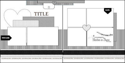
Hi all! I have a layout to share today using the latest sketch from Sketches In Thyme:

It is pretty rare that a sketch site puts out a two page sketch, and I have lots of two page layouts to do, so I jumped on this one! I used photos of my oldest at the zoo a few years ago:

I stuck pretty close to the sketch, but since I had the photos already printed, I made the sketch work for the sizes I had. I used Bella Blvd. Tiny Tots for the patterned papers- they are so great for zoo photos! I was also inspired by the current Take 5 challenge at Paper Issues (the bold items are the ones I used for my layout):

1. the color red
2. the color pink
3. the color turquoise or teal
4. three photos
5. a heart
6. patterned paper
7. a sticker
8. a tag
9. a stamp
10. cardstock
11. foam dots or squares etc. anything to give dimension
12. an arrow
13. ink, mist or paint
14. something gold
15. wood grain (this can be wood veneer, patterned paper etc. anything with a wood grain!)

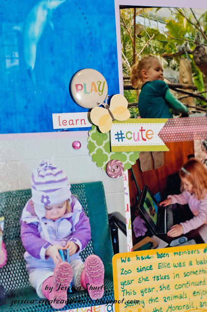
As you can see here, I used some foam adhesive to pop up the #cute banner and the butterfly. I also used some washi tape to bring some red to this part of the page.

Instead of a heart as in the sketch, I decided to make a flower around my title. I drew it in pencil and then used Liquid Pearls to make the dots. I also used more foam adhesive and washi tape for this cluster.

I trimmed one end of a tag for this cluster and used the other part by my journaling to add some more red to my page. The turtle was fussy cut from one of the patterned papers in this collection.

Materials:
Cardstock- Die Cuts With a View
Patterned Paper- Bella Blvd.
Stickers- Bella Blvd., Creative Imaginations
Tape, Badge- October Afternoon
Chipboard- Pink Paislee, KI Memories
Buttons- Jesse James Co.
Liquid Pearls- Ranger
Tag- Basic Grey
Dew Drops- Robin's Nest
Pen- Sakura
Punch- Marvy

Monday, February 15, 2016

Happy Birthday- Card Layout

Hello and Happy President's Day! I have a layout to share today!

First I was inspired by this sketch from Let's Get Sketchy:


I am always looking for new ways to display cards in my scrapbooks and I thought this sketch would work well for that! I had the photo of my kids and I and went from there. I also flipped the sketch horizontally because I was working with scraps and that was the way it worked best. The other challenge that inspired me was the current challenge at Another Freaking Scrappy Challenge:  February you may use one full sheet of paper only, and all other pieces of paper in the layout must be from your scraps. One embellishment must be leftover from a package where you have used your favourite embellies from it already, and have not found a use for the one you choose yet. 

The only whole sheet of paper I used was the background cardstock. The rest were scraps, many from this layout. I have a couple of embellishments that were "left over." The red and yellow tag behind my photo is from and OLD Basic Grey collection that I only have a few tags left from. The chipboard buttons are from a pack of Studio Calico buttons that a lot of the colors have been picked over. I used an embossing folder on some Core-dinations cardstock for the top right to mimic the paisley patterned paper in the bottom left. I cut the title and balloons with the Cricut and outlined them in black to make the stand out a bit. I realized after I uploaded the photo that I meant to add some journaling to the page, so I will go back and do that. :)

Thanks for stopping by to check out my layout!

Materials:
Cardstock- My Mind's Eye, Core' dinations
Patterned Paper- Die Cute With a View, American Crafts, Bella Blvd., other
Chipboard- Studio Calico
Pen- Sharpie
Transparency- Fancy Pants
Tag- Basic Grey
Die Cutter- Provo Craft
Cartridges- Cricut Classic Font, Stretch Your Imagination
Twine- Pink Paislee
Embossing Folder- Sizzix

Sunday, February 14, 2016

Scavenger Hunt Sunday 2-14-16

Happy Valentine's Day! I am here today with my photo for Scavenger Hunt Sunday! I didn't take a ton of photos, but I was able to find some for the prompts.

Daily Scene
This is my second daughter. She is a creator (hmmm, wonder where she gets that from? ;)). You can find her making something with paper and any other supplies she can get her hands on. Today she set up shop in the living room.

Discover
My youngest and I met some friends at the Children's Museum on Tuesday. His favorite area of the museum in this water area. There are so many fun things to do, like racing boats and discovering how the amount of water affects how fast the boat goes!

Pieces
They also had an Eric Carle exhibit at the museum and then had these bugs that could be taken apart and put together.

Where I Stand
The older kids had a dress up day for school on Friday. They were to dress up like what they hope to be when they grow up. We have an art teacher, zookeeper, and teacher. For my son's outfit, we capitalized on the fact that the local zoo employees wear very similar clothes to our kids' school uniforms, so I simply printed off the logo and attached it to his shirt! From where I stand their future looks bright! ;)

Details
One of the coolest things about the Children's Museum is their attention to detail. I thought this huge "grass" that the kids could move through was so cool! And it looks like the grass from and Eric Carle book!

Scavenger Hunt Sunday

Friday, February 12, 2016

Happy Valentine's Day! (With No Pink!)

Hi all! I have another card to share. This time it is a Valentine's Day card without the traditional red and pink! I was inspired by the sketch and inspiration photo at Fusion:

I stuck very close to the sketch, using hearts instead of stars. I used the colors and the mottled effect of the colors from the inspiration photo to get me to my hearts. I used my Cricut to cut the hearts from some glossy cardstock. This particular cut is from the "Walk In My Garden" cartridge and it is the flowers for the bleeding hearts. I was initially just going to use the hearts, but liked the way it cut, I decided to use the negative as well. The mottled colors in the inspiration photo made me think of alcohol inks, so that is what I used to color my card. I used some pearl and silver mixatives and blending fluid for the background piece. I took my inking tool and swirled the colors over the glossy cardstock. For the hearts, I just dropped a couple of colors and blending solution on the hearts until I was happy with the color. To attach those to the card, I used some foam adhesive for dimension.


I am also entering this card in the Bitten By the Bug Valentine Hearts challenge.

Stick It Down- Masculine Birthday Card

Hello! I am back today to share a card I made for my brother for his birthday last month. It is based on the February card sketch at Stick It Down:


As you can see, I flipped the sketch 90 degrees to make a wide card. For the background, I used light blue cardstock and tore some ground from some dark brown cardstock. I inked the edges of the brown cardstock to make it stand out a bit more. I stamped and fussy cut the trees. The moose was simply stamped and the panel edges with brown ink. It was attached with foam adhesive.  An evergreen branch and sentiment were stamped in the top right to finish off the card.
 Make sure to check out the Stick It Down blog and see what the rest of the design team did with the sketch.

Thursday, February 11, 2016

How to Grow an Animal Lover- Scrap Our Stash

Hello! I have a new layout to share! This time I am joining in over at Scrap Our Stash. This month's challenge is based on this book cover and using hearts on your page:

I decided to do a layout of photos of my older son at the zoo as a baby. We have the book that is featured and there are a lot of animals in it, so I thought it was fitting. 

I was inspired by the rays coming out of the title, so I created the same effect with a mask and an ink blending tool around my main photo. You can also see that I included some hearts here.

There is quite a bit of white space on this photo, so I decided to make an embellishment cluster here. I also brought the hearts over to this side of the layout by stamping a heart on the "adventure" card."

The title of the book also inspired the title of my layout. I mimicked the style of the title with die cut letters that I outlined in black and small letter stickers for some of the words. I also added hearts here with an enamel heart and some stamped hearts. Using hearts on a layout was also the challenge over at shimelle.com.


Materials:
Cardstock: Bazzill
Patterned Paper- Bella Blvd, Echo Park
Mask- The Crafter's Workshop
Ink- Ranger, Stampin Up
Stamps- Hampton Arts, Technique Tuesday
Die Cutter- Provo Craft
Software- Craft Edge
Cartridge- Walk In My Garden
Fonts- Just a Dream, Floraless
Tape- October Afternoon
Stickers- Bella Blvd, Fiskars, Die Cuts With a View, Basic Grey
Rub Ons- Plaid
Pen- Sharpie, Creative Memories, Zig
Enamel Dots- October Afternoon
Buttons- unknown