Fall is in the air, as my photos from this week indicate:
9/20 Addy with her leaf collection at the zoo
9/21 Will taking a bath
9/22 Will looking in his mirror
9/23 Some of my fall decorations that I got out this week
9/24 Addy in her room, I was trying to get a photo of her attempting to dress herself, but I was too slow, maybe next time...
9/25 Ellie building a Jenga tower (notice she hasn't quite gotten the alternating directions with each level
9/26 The leaves are starting to change!
Monday, September 27, 2010
Sunday, September 26, 2010
Scrapfest!
A little over a week ago I attended my 4th Scrapfest at the Mall of America. The first year I went, I only did the make and takes, which was fun, but meant a TON of standing in line. The last 3 years I have taken 4 classes, which has really added to the fun! This year I took the Key to Creativity workshop with Tim Holtz,Playful Pages by Dear Lizzy, Olivia Stationary Box with Bo Bunny, and The Power of Glimmer Mini Album. I was there all day Friday and for a few hours on Saturday. Friday was the day I took my classes and I thought it would be the only day I would get to go, but on Saturday Rick surprised me by suggesting that I could go back if I brought Will. So I stood in line and did some make and takes on Saturday. Will was a perfect angel and slept most of the time! Over the two days I was able to do 11 make and takes.
Here is the book we made in the Tim Holtz class.
At the end of class he surprised us by telling us we would get to keep the inks and paint that we used in class and would also be receiving a pack of Grungeboard and some new Texture Fades (embossing folders)!
Here are the layouts we made in the Dear Lizzy class. We actually only got started on these in class. They sent directions home with us and I finished them today while "watching" football.
There were also quite a few leftovers from this class as well!
Here is a card I made today after I completed the layout with some of the scraps.
We only had time to make the box part of this project in class, but it took less than an hour to add the details and make the cards once I got home.
I haven't finished my Glimmer Mist album yet. In fact, it will probably be a while until I do. I want to get a few of the colors we used in class and I need to decide what I am going to use for pictures in it.
Finally, I did this card for the Go Green challenge at Challenge Masters. The challenge was to make a project using only cardstock, no patterned paper. I used some leftover cardstock from a layout a made about a week ago.
Here is the book we made in the Tim Holtz class.
At the end of class he surprised us by telling us we would get to keep the inks and paint that we used in class and would also be receiving a pack of Grungeboard and some new Texture Fades (embossing folders)!
Here are the layouts we made in the Dear Lizzy class. We actually only got started on these in class. They sent directions home with us and I finished them today while "watching" football.
There were also quite a few leftovers from this class as well!
Here is a card I made today after I completed the layout with some of the scraps.
We only had time to make the box part of this project in class, but it took less than an hour to add the details and make the cards once I got home.
I haven't finished my Glimmer Mist album yet. In fact, it will probably be a while until I do. I want to get a few of the colors we used in class and I need to decide what I am going to use for pictures in it.
Finally, I did this card for the Go Green challenge at Challenge Masters. The challenge was to make a project using only cardstock, no patterned paper. I used some leftover cardstock from a layout a made about a week ago.
Saturday, September 25, 2010
Project Scrapbook Weeks 3 and 4
Mikki has been coming up with great challenges for us the last couple of weeks! Last week the challenge was called "Seeing Double". Here are the rules:
This week is 2 page layouts! All layouts submitted this week MUST be 2 page layouts! I hope this doesn't get too confusing. As always, please send PM me with any questions you might have! :biggrin
8.5 x 11 (double layout): 30 points
12 x 12 (double layout): 40 points
Title - 10 points
Pictures - 10 points per picture
5 extra points if you use the same picture twice but in a "different way". Zoom in on a particular aspect, crop the picture, use different filters, add words.
Journaling
50 words or less - 25 points
50+ words or more - 35 points
Embellishments/stickers - 5 points per embellishment
"Make it Work" - Mirror Mirror on the Wall Bonus - 100 points
The pages should mirror each other. Same "layout" but reversed. All embellishments must be in the same place, pictures in the same place.
If you have added a journal block on 1 page it can be mirrored with another picture, but try to make them as similar looking in shape as possible.
If your title is on 1 page and not across both, you can use other "word" embellishments or similar in size embellishments (line of embellishments ect) but please try to fill the space similarly.
I really enjoyed this challenge! I make two page layouts quite often and I tend to really like symmetry, to the point that I usually fight it, so this was a great way to "let loose" and give in to my natural tendency. I did Addy's 6-12 month "Milestone" page for this.
Here are my points:
12x12= 40 points
Title= 10 points
Pictures= 8x10= 80 points
Journaling= more than 50= 35 points
Embellishments= 56x5= 280 points
Make it Work= 100 points
Total= 545 points
This week's challenge was a tougher one. It was called, "You're Being Childish" and here are the rules:
Create a layout about your favorite children's book... the kicker? You MUST do it in the style of the book itself.
8.5 x 11 - 15 points
12 x 12 - 20 points
12 x 12 Double Layout - 40 points
Title - 10 points
Title in the writing style of the book - 15 points
*example: if you choose a Dr Seuss book, use crazy words and fun rhymes
Pictures - 10 points per picture
Embellishments/stickers - 5 points per
*Title stickers count as 5 points
Journaling
50 words or less - 25 points
50+ words or more - 35 points
"Make it Work" Bonus - 100 points
Create a layout using the style of your favorite Children's Book... but the layout CAN NOT be about the book itself.
Example: Is your kid a picky eater? Use the style of Green Eggs and Ham.
Trip to the park. Why not create a layout using the colors of Corduroy?
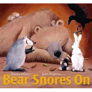
As I was reading the October issue of "Creating Keepsakes" I had noticed a layout of photos taken by a child using the story "If You Give A Mouse A Cookie" as inspiration for the journaling. When I saw it, I knew I wanted to do something similar with the photos Ellie has taken. This challenge was perfect and got me to do a layout I probably would have put off. I chose the book "Bear Snores On" because it is one of my favorites to read to my children. I love the rhyming, it is a really fun book to read. Here is the cover:
Here is my layout:
The journaling reads:
In a dark green house
Along Dana Drive
Lived 3 little children
Under age five.
The oldes one, Ellie
Was such a shutterbug
She took lots of pictures
Even of the rug.
She had toys with which to play
and the flowers all of May,
But Ellie snapped on.
She wandered the house
Looking for "art,"
And someone she loves
With all of her heart.
She looked all around
And captured her toes,
Caught one of "Arthur,"
Her favorite show.
She could tell Mom and Dad
'Bout the fun that she's had.
But Ellie snapped on.
One day her sister,
Wanted in on the fun,
But as for the camera,
They only had one.
So they made a great deal
To learn how to share.
They laughed and they cried
To make it all fair.
Good thing it's not film
For it would be gone.
They've learned to take turns...
And they both snap on.
Here are my points:
12x12= 20 points
Title= 10 points
Title in the writing style of the book= 15 points
Pictures 14 x 10= 140 points
Embellishments= 13 x 5= 65 points
50+ words= 35 points
Make it Work bonus= 100 points
Total= 385 points
Tuesday, September 21, 2010
Three Cards, Two Challenges, and 1 Layout
I made a few cards the past week for various occasions. The first was Rick's birthday:
The next was to celebrate the birth of a friend's baby (his initials are TC).
The girls also made cards for him. :)
Then I made a card for a baby shower. This one was also for the Surprise Challenge at Challenge Masters. The challenge was to make a "shaker card". To make mine, I cute the bear using the Cricut and the Doodlecharms cartridge. I used a craft knife to cut out the middle of the belly. I cut a piece of transparency to match the size of the hole and glued it over the hole. Then I cut foam adhesive into small pieces and lined the edges of the hole. I poured a few colors of beads into the "bowl I had created with the foam and then pressed the card onto the the tape to attach the accent.
Finally, I made this layout with pictures from my brother and sister-in-law's wedding from last year. I did the Manufacturer Challenge for this one. The challenge was to use products from 4 of the following manufacturers: Bazzill, Echo Park, Fancy Pants, Bo Bunny, Making Memories, American Crafts, and Prima. I used Bazzill Bling for the mats, Bo Bunny for the background, American Crafts Thickers for the title, Fancy Pants rub-ons, and Prima polka dot flowers.
Project 365 Week 5
This past week we celebrated Rick's birthday and started our "school year" schedule, and I got to enjoy my birthday gift (Scrapfest!) so it was a busy week. I only missed taking a photo one day though, so I have included an extra photo from Rick's birthday.
9/13 Ellie making a birthday card for Daddy
9/14 Rick and the kids
9/14 Rick's cake, I used the game Memoir 44 as inspiration
9/16 Ellie before her first night of dance
9/17 Tim Holtz at Scrapfest. If you don't know who he is or about his amazingness, you can check out his blog here.
9/18 Ellie playing Tobago
9/19 Sara and Weston at their shower
Thursday, September 16, 2010
Project 365 Week 4
We've had a busy week! So here are my photos from last week (finally!).
9/6- Our friends' new baby, 2 days old
9/7 Flowers from the Farmers' Market
9/8 Where our pillows usually reside. The girls like to make paths, houses, etc. with them.
9/9 Ellie looking at the flamingos at the zoo (one of her favorites).
9/10 Will is 2 months old!
9/11 Rick, Ellie and Addy in the Jim's Apple Farm candy store- it was huge!
9/12 The Memoir 44 board as Rick and I play one of our nightly games.
Sunday, September 12, 2010
Two New Layouts
This week I managed to complete two layouts. The first was for week two of Project Scrapbook. Here was the challenge for the week:
Food plays a huge part of our lives, even at gatherings people tend to gravitate towards the kitchen. Scrapbooks are a great place to celebrate those gatherings, however the little times away from Christmas, Thanksgiving and parties tend to get neglected. Remember, ever day life is just as special as the big moments! Take a moment to appreciate the day to day and the great food memories. A special meal you make for someone. The Funny word your kid/grandkid uses for "Spaghetti". Even a funny food story or a trip out for ice cream.
8.5 x 11 - 15 points
12 x 12 - 20 points
12 x 12 Double Layout - 40 points
Title - 10 points
Pictures - 10 points per picture
Embellishments/stickers - 5 points per
YOUR LAYOUT MUST INCLUDE
Journaling (recipes not included)
50 words or less - 25 points
50+ words or more - 35 points
"Make it work" bonus - 100 points (in addition to the above points)
Use a piece of packaging/logo of the food you are discussing in the layout. In addition, you are only allowed to use the colors on the packaging/food item. If you special thing is eating out, use only the colors from the logo.
I was initially going to make a page about how my 3 1/2 year old says avocados (hadocados), but then my husband suggested I do one using the photos from making smores. What a great idea and it gave me more colors to work with for the "Make it work" bonus!
I used some craft foam to make the marshmallow accent. I used chalk on that and the letters to give them a roasted look. I was inspired by a camping layout on page 22 of the August issue of Scrapbooks, Etc. The food labels in the bottom right corner are cut from the actual packages (I had to move my marshmallows to a Ziploc bag). I am much happier with the result of this challenge!
Here is my point breakdown:
12x12= 20 points
Title= 10 points
Pictures= 4x10= 40 points
Embellishments= 5x 12= 60 points
Journaling= more than 50 words= 35 points
Make It Work= 100 points
Total= 265
The second layout was for the Technique Challenge at Challenge Masters. The challenge was to do reverse masking. With reverse masking, you are altering the paper within the mask/stencil and preserving that around or outside it. For mine, I flipped over the striped border strip and used an ink pad for the border on the left of the photo strip. I also used a circle template with white acrylic paint and green chalk under the title.
Monday, September 6, 2010
New Projects and Project 365 Week 3
Well, it's been a busy week, but I have found a little time to get some scrapping done and take pictures each day. I will start with my scrapping projects. The first is a layout that I used this sketch from Sketchy Thursdays:
Here is the layout. It was fun to just play around with product and use one of my new border punches.
I've decided to start building my card stash by using the scraps from the layouts I make to create a card. Here is the one I made using scraps from the above layout.
Here are my photos for the week:
8/30 Our friends' newborn baby
8/31 My water bottle and flowers collected by my girls at the park
9/1 My girls playing in birdseed in the driveway
9/2 A polar bear at the Como Zoo
9/3 My daughter in the ball pit at open gym
9/4 My daughter having a smore
9/5 Bottles and pump pieces, my life has revolved around these things for the past week as we try to figure out what is going on with my son's digestion
Subscribe to:
Posts (Atom)