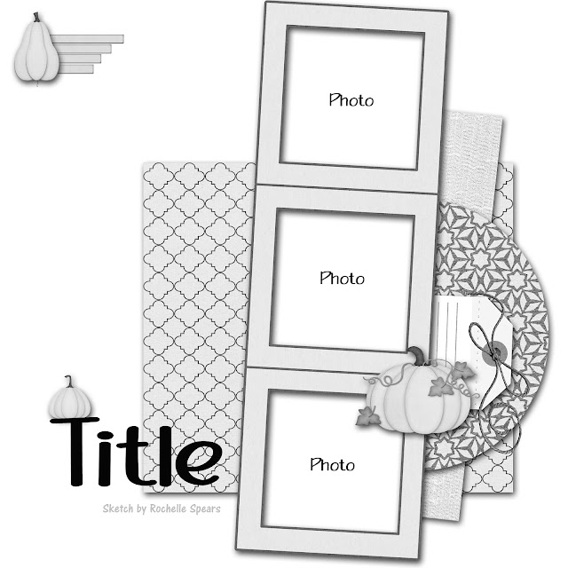
Hello, I have another new layout to share today! I started with the new October sketch from Rochelle Spears:
I used the sketch for the left hand page of this two page layout. I also used papers and elements from the September Scrap Room kit. The fun, bright colors and patterns went so well with my photos. To connect my two pages, I layered some of the patterned papers under my group of photos on the right page. For my title, I used a combination of tiny letter stickers and green foam Thickers. To add some texture to my page, I used a canvas piece that I spread molding paste through a mask onto. Once that was dry, I colored the whole thing with Abandoned Coral Distress Stain. I punched a hole and strung a scrap of ribbon through it. Since these photos are from three different museums, I used three journaling stickers so I could say a little about each place next to the photos from there. To embellish the page, I used die cuts and foam stickers that were included in the kit and washi tape and stickers from my stash.
I was inspired by the current Use Your Stuff challenge to use small type- I used the mini letter stickers for part of my title. I also completed Scrap With Stacy's tic tac toe challenge, using the center column: washi tape, flowers, and circle.
Thanks for stopping by!


