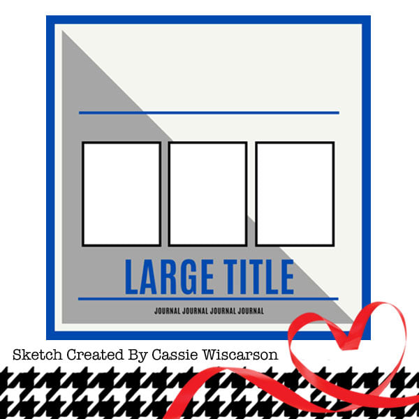
Hello again! I have another new layout to share. I used one of the Paper Issues sketches for this one:
I've had the blue paint stroke patterned paper scrap sitting in my stash for a bit, waiting for the right opportunity to use it. I sawt his sketch and came up with the idea to make the same concept with orange for the bottom half. I am really happy with how the background turned out. I then layered my photos over the background and used a branding strip for the stripe across the top and cut a strip from a coordinating paper for across the bottom. When I was looking for papers to cut the title from, I came across a scrap of orange Hambly transparency and decided to use that on my layout since it matched so well! I cut the title with my Cricut and found a few die cuts and stickers to embellish the page. I finished things off with some sequins.


No comments:
Post a Comment