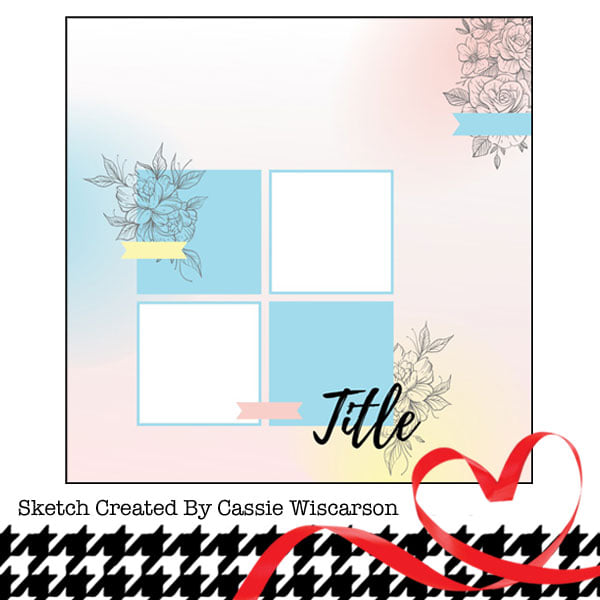
Hi all! I have a new layout to share, but some of the elements and photos may look familiar. I scrapped this event for my younger daughter's album earlier this month and now created a page for my older daughter's album. I was also inpired by this Paper Issues sketch:
I started with kraft cardstock for my background. I wanted to add some interest so I had selected some brown and orange Distress and Distress Oxide inks to blend onto the background. When I was looking for blending sponges, I came across the sponge for white and decided to use a pebble mask and white ink over my browns and oranges. I really like how it turned out! I then added my photos. The title and embellishment cuts are the same ones I used for my other daughter's layout. I liked how they looked, so I figured, why not? I used a little washi tape under my title and behind my photos, along with a branding strip behind the photos. To embellish the page, I used those Cricut cuts, fussy c ut some presents and used some stickers and puffy stickers. I found a coordinating tag for my journaling and tied a bit of ribbon through the hole. This is a fairly flat layout, but I did use some foam tape to add a bit of dimension.
Thanks for stopping by to check out my layout!


No comments:
Post a Comment