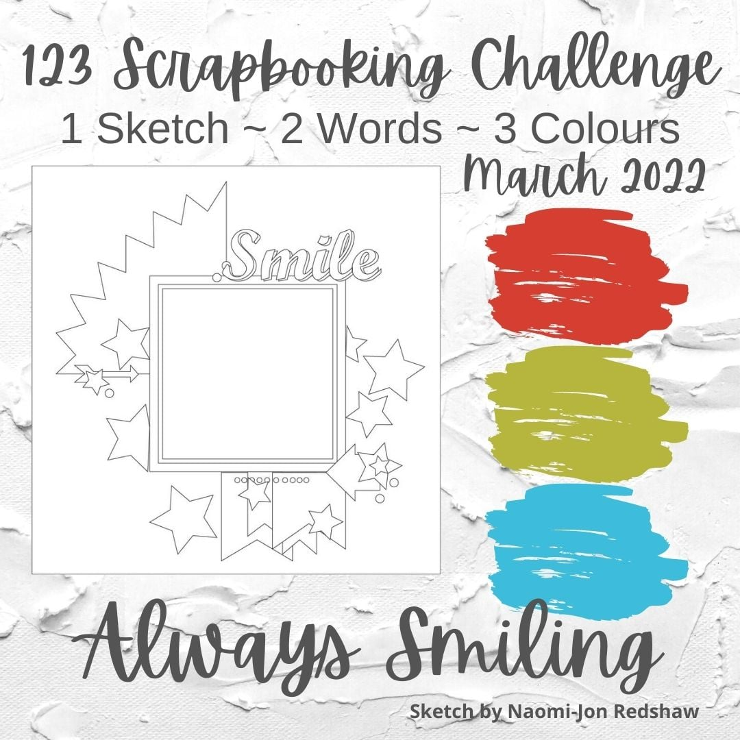
Hello! I have another layout to share today! For this layout, I was inspired by the current challenge from 123 Challenge:
I thought the color scheme would make for a great boy page, so I pulled some photos of my oldest son at some playdates. (The current challenge at Use Your Stuff is to make a masculine page too!) I made the photo area bigger to accomodate all my photos, which meant I had to move the banners to the side. I took the inspiration of the area in the top left a couple of ways, I added a circle and then a strip of paper cut with a pinking edge scissors (yes, I used a decorative edged scissors!). I had thought about die cutting some stars, but instead opted to use a mask and colored some molding paste blue to match my papers. I love the texture it gives to the page! I cut the title using my Cricut. I embellished the page with some puffy stickers, some things I fussy cut from patterned paper, a wooden button, letter stickers, and silver Nuvo drops.
Thanks for checking out my layout!


I love all the alterations to the sketch to make it uniquely yours. The color inspiration works so well with the photos and I love all the different textures. Thanks for sharing with us at Use Your Stuff
ReplyDeleteWhat a great fun layout - love it!
ReplyDeleteThanks for joining us at Use Your Stuff.
Helen x