Pages

Sunday, August 31, 2014

September Calendar Page

Look at me!  I have my calendar page done in time for the first of the month!  This month, I was once again inspired by a sketch at Stick it Down:


I stuck pretty close to the sketch and I had some fun with Basic Grey's Capture line.  I really enjoyed working around the triangle paper on this one.

I was stumped for a bit as to what to use for embellishments, but then I found the the fun stripey Prima flowers and thought they worked well with the papers.  I pulled out some other flowers in a coordinating blue and a couple metal flowers.  Behind my title and journaling block, I used a Bella Blvd. feather for some added texture. My title was made with some old Basic Grey letter stickers.  I used the periods from that set to separate my events in the journaling block.

I felt that the light blue paper I used across the bottom was a little plain, so I fussy cut the strip from a piece of patterned paper (to which my husband said "good luck" when he saw me start cutting it out).  I really like what it adds to the layout.

The 8/25 challenge over at My Scraps and More was to tear at least two things on your layout.  I tore the far right end of my washi tape and I also added a couple of small pieces of paper that I tore to bring some of the yellow over the the left side of my layout.

Materials:
Cardstock- Bazzill
Patterned Paper- Basic Grey, Echo Park, American Crafts
Stickers- Basic Grey
Flowers- Prima, Michael's
Metal Flower- Momenta
Pen- Newell Rubbermaid, Sakura
Tape- Glitz
Feather- Bella Blvd
Buttons- Hero Arts

Wednesday, August 27, 2014

CAS(E) this Sketch #89- Wedding Card

This past weekend we celebrated my husband's cousin's wedding.  It was a beautiful wedding and a great time with family. Of course, I needed a card for the occasion! I was inspired by this sketch at CAS(E) this Sketch:

I made the inner panel by running a piece of white cardstock through my Texture Boutique machine with an embossing folder.  The glasses were cut with my Cricut.  I added some sparkle with some clear glitter embossing powder. I stamped and heat embossed the sentiment on a scrap and cut the banner ends. I took a ruler and silver pen to create the outline to finish it off.

Thursday, August 21, 2014

Tiny Dancer

Hello!  I have a layout to share today!  I was inspired by last week's Got Talent mini challenge at My Scraps and More.  The challenge was to use a book's title as the title of your layout and use a library card pocket on your page with journaling on it.  

I used Echo Park's "Capture Life" line by Allison Kreft.  The wood pattern that I used on either end of my layout reminded me of the gym floor in several of my photos.  I used a few other papers that I felt fit either thematically or had colors that worked with my photos.  

I also used some die cuts and transparency pieces from Heidi Swapp.  I layered up a couple of stars by the title.  I also filled in the letters of the "smile" die cut with Stickles to make it fit the colors and theme of my page better. 


Materials:
Cardstock- American Crafts
Patterned Paper- Echo Park, Jillibean Soup
Tape- My Mind's Eye, Bella Boulevard
Die Cuts- Heidi Swapp
Glitter Glue- Ranger
Letter Stickers- Basic Grey, Mark Richards
Stickers- October Afternoon
Stamp- Hero Arts
Ink, Bow- American Crafts
 Pen- Newell Rubbermaid

Sunday, August 17, 2014

Baby Card- Stick it Down

Hi all!  I'm doing a quick post tonight to share a card I made for my new nephew!  I used this week's card sketch from Stick it Down:

For my card, I cut out the boat with my Cricut.  I made the background on watercolor paper.  I colored the waves with gelatos and then went over them with a wet paintbrush.  I took some of the color and washed it across the top part to give my sky some color. I finished it off with some washi tape, a punched circle and a button.

Monday, August 11, 2014

Mojo Monday: Happy Birthday

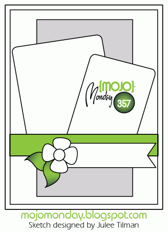
I have a card to share today that I made late last week. I used last week's Mojo Monday sketch for inspiration:


I swapped the large and small pieces in the sketch.  The 6 was cut from a piece of patterned paper.  I cut the bike using my Cricut and the "Boys Will Be Boys" cartridge.  My color inspiration came from the striped paper I used.


Tuesday, August 5, 2014

August Calendar Page

I am a little late posting this, but I was only a day late getting it done.  I was inspired by this sketch from Stick it Down from a few weeks ago.  


I started by misting over the dragonfly mask in the top corner.  The papers are October Afternoon "Public Library".  I stamped some flowers that went with the flowers on the patterned paper. I did computer journaling cut into strips again this month.  It seems to work well for this style of layout.

Here is a close up of the misting and stamping in the top right corner.  How cute are those Jillibean Soup wood and gem embellishments?


Materials:
Cardstock- Die Cuts With a View, other
Patterned Paper- October Afternoon, Simple Stories, American Crafts, Die Cuts With a View
Stickers- Basic Grey
Wood Pieces- Jillibean Soup
Fonts- Artistamp, Medium, Deftone Stylus
Ink- Tattered Angels, ClearSnap
Tape- My Mind's Eye, Bella Blvd
Trim- Doodlebug Designs
Mask- Tattered Angels
Stamps- Fancy Pants Designs, Autumn Leaves
Sketch- Stick it Down

Sunday, August 3, 2014

Two Cards

I have a baby card and a birthday card for a one-year-old to share today.  I was inspired by sketches for both.

First up is a baby card for my friends' twins!  I was inspired by this Retro Sketch:


I turned the sketch a quarter turn.  The hearts were cut using the New Arrival Cricut cartridge.  I cut varying widths of patterned paper for the rays and then added the ribbon to go with the red in the center circle of patterned paper.  I added the babies' initials to the hearts and outlined them in red.  I finished it off by, stamping baby sentiments on the rays.


Next up is a birthday card for our God daughter.  I was inspired by this week's challenge at CAS(E) this Sketch.  In addition to using the sketch, you are to use a tag on your project.

I used up what was left of this collection to make this card.  The cute little flower is from the New Arrival Cricut cartridge. I stamped a text background stamp on my card base to give it a little texture and added everything else on top.


Saturday, August 2, 2014

Scavenger Hunt Sunday 8-3-14

Wow, I took a lot of photos this week!  I think I may be using some in the weeks to come because this week's scavenger hunt doesn't even begin to cover the events of this week!  And, there are hardly any photos of my kids this week!

Animal
Insects are animals, right?  Today I took a photography class and we had the opportunity to walk around a garden for two hours, just snapping photos and trying different things.  It was a lot of fun! That is where I shot this, There were a bunch of these flowers, with several of these bugs flying around and landing on them.  I liked how they looked blue metallic.

Frozen
Sorry folks, it's the 1/3 of the year that it ISN'T cold here, so I went with water frozen in time, no ice. ;)

Handwriting
We went to the county fair last Sunday.  Here is a sign telling us that the little lamb in the photo was born the previous day!

Naptime
No photos of sleeping kiddos for this one... ;/ Just a sleeping mama lion through a fence.

Two Things
There were two really cool fountains at the park we were at today (the other is pictured above.  Here are two (of the three) heads shooting out water.

Bonus: Upside Down
This was one of the prompts last week.  Well, I had a photo this week that fit this prompt perfectly, so I brought it back.  At the zoo we went to this week, there is a conservatory.  In the conservatory, there were these flowers that grew out of the bottom of the pots.  My dad thought it would be funny to hang my youngest upside down next to them "to make it look like they were growing the right way." :) So, how'd we do?


Friday, August 1, 2014

Pizza Party- My Scraps and More Sketch #88

It's August 1st, how did that happen?! Today there is a new sketch up at My Scraps and More:


I really liked how the three photos were arranged on the original sketch, but I didn't have any sets of 3 photos printed out.I ended up squeezing in another photo and moving things around a bit.  


For my title, I cut out my letters using my Cricut and Sure Cuts A Lot. For the word Pizza, I popped up the letters with two different thicknesses of foam adhesive.  I didn't have any journaling spots that worked with my colors here, so I made my own with some of my patterned paper.


Materials:
Cardstock- Bazzill
Patterned Paper- Provo Craft, My Mind's Eye, Fancy Pants
Brads- Basic Grey, My Mind's Eye
Punch- Marvy
Glitter Glue- Ranger
 Pen- Zig
Ribbon- Unknown
Button- Jesse James Co.
Die Cutter- Provo Craft
Software- Crafter's Edge
Cartridge- Doodlecharms
fonts- Joint by Pizza Dude, Doctor Jekyll